

The Use Of Colour In Office Interior Design
This year, we looked at a range of colours in the context of office interior design.
To round off the series of posts, we have summarised our key thoughts.
Find the full set of blogs via our Focus Blog page by clicking here.
The Psychology of Colour in the Workplace: Designing Inspiring Office Interiors
When it comes to designing an office space, the choices you make extend far beyond furniture and layout.
The colours you incorporate into your workplace interior can have a profound impact on productivity, mood and overall workplace culture.
Understanding the psychology of colour allows you to create an environment that fosters focus, creativity and positivity.
Here, we explore the psychological effects of various colours and how they can be applied in workplace interior design to create optimal environments for different needs.
Red: The Colour of Energy and Passion
Red is a bold and stimulating colour that evokes energy, excitement and determination.
It’s often associated with passion and urgency, making it a good choice for spaces where high-energy activities take place, such as sales offices or brainstorming areas.
However, use it sparingly, as too much red can be overwhelming and even increase stress levels.
Yellow: Optimism and Creativity
Yellow is the colour of sunshine and is often linked to happiness and positivity.
It can stimulate creativity and encourage a cheerful atmosphere.
Yellow works well in collaborative spaces or areas where innovation and brainstorming are key.
However, softer shades are sometimes preferred, as bright yellow can become overbearing.
Blue: Calm and Focus
Blue is widely recognised for its calming and serene qualities.
It promotes focus, trust and efficiency, making it an excellent choice for offices where concentration is crucial, such as accounting firms or technical workspaces.
Light blue can create a sense of openness, while darker shades can lend a more professional tone.
Green: Balance and Well-being
Green represents nature, balance and growth.
It’s a refreshing colour that helps reduce stress and promotes a sense of well-being.
Green is ideal for offices where employees spend long hours, as it is easy on the eyes and helps maintain a harmonious atmosphere.
Incorporating plants alongside green accents can amplify its calming effect.
Grey: Neutral Sophistication
Grey is often used as a neutral base in office design.
It conveys professionalism, sophistication and balance.
While grey can provide a sleek and modern look, too much of it can feel cold or uninspiring.
Pairing grey with warmer or brighter accent colours can help maintain energy and interest in the space.
Black: Authority and Elegance
Black exudes power, authority and sophistication.
It can be used to create striking contrasts or to add a sense of luxury and formality to a workspace.
However, too much black can feel oppressive, so it’s often best used as an accent rather than a dominant colour.
White: Simplicity and Cleanliness
White symbolises purity, simplicity and cleanliness.
It’s a versatile colour that can make spaces feel larger and brighter.
While it’s great for creating a minimalist aesthetic, too much white can feel sterile or bland.
Combining white with textures or pops of colour can make the space feel more welcoming.
Orange: Warmth and Enthusiasm
Orange is a warm and invigorating colour that can inspire enthusiasm and energy.
It’s great for break rooms or informal meeting areas where interaction and socialisation are encouraged.
As with red, moderation is key to prevent overstimulation.
Pink: Calm and Nurturing
Pink is associated with softness, compassion and calm.
Lighter shades of pink can be used to create a nurturing and stress-reducing environment, while brighter pinks can add a playful or creative touch.
Pink works well in lounges or areas where relaxation is encouraged.
Purple: Creativity and Luxury
Purple is often linked to imagination, creativity and luxury.
It’s a great choice for design studios or innovation hubs.
Lighter purples, such as lavender, can create a calming effect, while deeper shades can evoke sophistication and elegance.
Brown: Stability and Warmth
Brown is a grounding colour that conveys reliability and warmth.
It works well in creating a cosy and inviting atmosphere, particularly in areas where collaboration or relaxation take place.
Wooden furniture or accents can introduce brown tones naturally, adding an organic feel to the office.
Brown tones can also play a key part in a biophilic design theme or strategy.
Conclusion
The colours you choose for your workplace interior have a psychological impact on employees and visitors alike.
By strategically combining colours to suit different functions and moods, you can create a dynamic and effective work environment.
Whether it’s the energising power of red, the calming influence of green or the creative spark of purple, every colour has its place in fostering a productive and inspiring workplace.
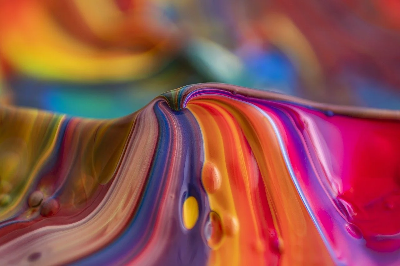
Image credit: Mountain Colors Paint - Free photo on Pixabay
At Fenway®, we design, build, furnish and support office interior spaces in Central London. We responsibly deliver fit-out, refurbishment and alterations projects for occupiers and owners. We are focussed commercial property specialists ready to bring our expertise, energy and experience to your workspace. Contact us now to discuss your plans.